Making of FOURFOLD
FOURFOLD was my entry to the JS13K games competition, it ranked way better than my expectations; 7 overall, 4 in mobile category and 16 in WebMonetization category. Along with appearing in top 10 four times at the individual criteria.
Play it on the jam page or on itch.io.

After being absolutely stumped by what people were pulling off with such a size limit in the past years, I decided it was time I too joined in on the fun.
Idea
I set myself some goals before the jam had started:
- Make a puzzle game
- Use WebGL, I've been learning it for some time now but haven't made anything noticable with it yet
- Aim for top 115, I mean who doesn't like that sweet T-shirt?
My standard procedure for generating puzzle game ideas involves binging through GMTK's Puzzle Design playlist followed by roughly sketching out whatever comes to my mind, regardless of whether it makes sense. Then I try to look at it all and piece together a core logic, keeping in mind the elasticity of the general idea and room for variations to create interesting puzzle scenarios.
The theme for this year was 404, my first thought was that this theme will generate lots of games involving HTTP packets, to stand out, I should NOT make a game about HTTP packets.
That made everything rather difficult, because LITERALLY everything that comes to mind when I look at 404 is HTTP packets!
It took me about 4 days to settle with a decent idea. I was heavily insipred by games like snakebird, which make you think about every move you make. I also love games with a calm and serene aesthetic, and I tried incorporating some of those elements into the the game.
That involved getting the player into a rhythm-like state, so that all the focus would be on puzzle solving. And that also meant refraining from adding any feature that didn't directly complement the core puzzle gameplay.
I didn't want the player to end up not feeling good after playing the game, even if they don't complete it. So I tried to remove or refine any elements that could be percieved as negative. For example, enemies, game over screens, or a life system. Also notice how the player cube almost immediately spawns back at the start upon falling, signifying that losing isn't that big of a deal. This takes away some of the pressure and maintains a positive atmosphere for the game.
Platforms
I first started out with the static red platform, thinking that I'd add some 2-3 different platforms to breathe variety into the levels, there's a lot of possible variations but I refrained from implementing most of them because of my growing concern of code size. I regret not adding many interesting ones that I came up with, like platforms that move when stepped on, platforms that push the player to a different direction, and platforms that teleport the player, so many cool level ideas come to mind. I may add them in the future, if I ever get motivated enough to turn this into a full game.
I did however create an "orange" platform, which was like yellow, but had to be stepped on twice before it dissapeared. I scraped it out in the end because it wasn't fun and made levels rather mundane.
The rendering is really straightforward, because the platforms are just standard cubes. And since there is no rotation, I saved some bytes by drawing only the visible part of a cube:
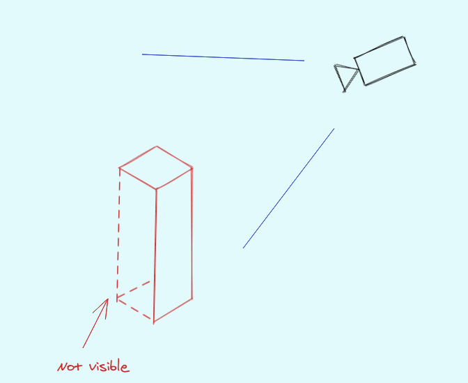 Only half the vertices required! The shader handles the coloring and shadows. If you observe closely, you'll notice that the platform color fades out into the background from top to bottom.
Player
The player character/cube/whatever is just a smaller version of the platform. The white light filling it up is calculated in the shader itself, by simply stepping the pixel height with the steps taken:
pixelHeight = 1.0 - (aVertexPos.z / height);
...
float light = step(pixelHeight, curStep);
The piano-like sound is made possible thanks to the amazing ZzFXM library.
At first, I wanted the cube to jump instead of sliding around. But I couldn't implement it in time.
Levels
The levels are represented as a square grid. Square because it makes things much simpler and reduces the code size a lot.
It probably isn't obvious since I haven't mentioned this anywhere, but you can easily pan and move the level around by dragging the scene with the cursor. I did this because placing the platforms such that the entire level is visible at once proved to be difficult. I ended up simply placing the grid starting with one-fourth of the screen from the top left.
I could have made the scene zoom out according on the grid size, but all the levels seemed to look fine by the end.
The level data is converted to and stored as a string using a simple RLE algorithm, with a substitution character for every platform type.
Manually making strings of level is really difficult, so I also planned to make a level editor.
Editor
I didn't want to slap in an editor just for the sake of it, but wanted it to be fully fledged and complete.
It had to be simple and easy to use, while also allowing to quickly create any kind of level. I used the editor to create all the levels, which helped me iterate on and improve it.
The editor without the background. Looks pretty neat actually:
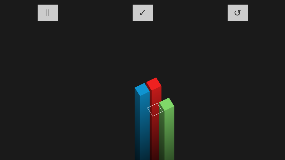
- The pause "icon" is simply two
Is. - The finish and reset buttons are just unicode symbols.
UI
I admit I went overboard with the UI, something not very common in JS13k entries, but it acts as a bridge for players to get to the gameplay, and is important to get right.
Many UX philosophies state that a good interface is invisible to users. It should get them to the important bits as quickly as possible and stay out of the way, but still be within reach. I ended up creating a mini-framework which could almost be used in itself.
Initially, I started creating the UI inside the game loop itself, it's possible but can be clunky and makes the code very awkward, so I switched to using HTML for the UI. Moreover, HTML is presently the most flexible UI toolkit on the planet! There is really no reason to not use it when it's available right there.
There's no way I could afford to throw in a font file, so I rolled with a web-safe font.
Looking at cssfontsack.com, I picked Trebuchet, it is sans-serif and seemed widely available.
A very simple way to make default fonts look better is to use a smaller font-width. Thin fonts really tend to stand out:
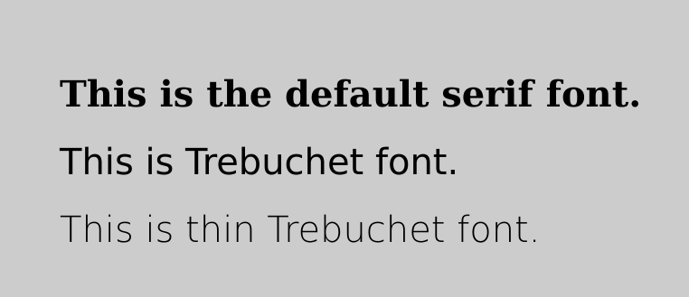 All it takes is a single line of CSS:
font: 100 2.5rem Trebuchet, sans-serif;
Web monetization
Web monetization is a really cool protocol that I hope becomes more mainstream.
I was careful to not take the game to pay-to-win territory. Changing the background is a good idea, gives the ability to change the overall look and feel without affecting gameplay.
The second exclusive feature is the yellow platform in the level editor. And would act as a nice incentive to paid users.
Backgrounds
The backgrounds are made purely out of shaders. I'm quite happy that all game assets are generated using code.
I'm very new to shader programming, but I think being able to create complex objects using distance fields is beautiful. I'll probably write a separate post explaining the shaders in detail, but here's the general summary:
- Morning: I was looking to achieve the look of a backdrop with mountains (a friend told me they look more like clouds). The light at the top-right is a simple circle SDF, and the mountains are made using sine functions.
- Night: A starry night-sky (the friend told me they look like fireflies, whatever floats your boat I guess). It was simply my half-assed implementation of this cool tutorial.
- Retrowave: Coil exclusive theme. The sun is again a circle SDF, and the moving grid lines is a surface bent using normalized Y values.
- Abstract: Another Coil exclusive theme. More sine waves. I feel that I should've done more here.
Compression & bundling
I tend to not worry much about size until I've used up at least 60-70% of the limit. Having managed to finish everything inside the 13 kilobytes, I did not have to worry about using whacky compression techniques and was able to largely stay away from JS dark magic.
I used the awesome esbuild for bundling and minification, this lightning-fast tool absolutely blows away all other JS-based bundlers by a very large margin in speed. I'm obsessed with it! The web development ecosystem desperately needs more such tools in my opinion.
Compression is done with good 'ol zip, turning on all the options for maximum compression.
Anyway, here's the obligatory "All the code in a single image":
 Along with that, there's a tiny amount of HTML required to setup the canvas, along with a bit of CSS sprinkled in for the UI.
Takeaways
Some things that I learnt along the way, and stuff that seemed important to me. Especially in competitions like these.
Browser support:
I know the rules say targeting any one browser is enough. But what are the odds that a random person would: a) notice their current browser isn't running the game properly, b) copy the url, c) open a new browser, and d) paste it to start playing?
That is a lot of effort expected from the user's side. And all that is assuming they have another browser installed! (You better pray they don't end up opening IE)
Start simple:
Starting with a simple game idea means you can prototype it quickly, see if it's fun and expand as you go. Compare that to if you started with a rather complex idea, took a while to get the core mechanics working, and then find out that it's not as fun as you hoped it would be.
Create a playable prototype first:
This builds on the previous point. Finishing a fully runnable prototpe first and then iterating on that is somehting I find extremely helpful in everything I build.
Conclusion
Although there were things I could have done better, I'm pretty satisfied with the overall result. And I'm glad I finished it on time.
Most importantly, I had a lot of fun making the game. Which is all I cared about. And the overwhelming amount of positive feedback from the JS13k community and everyone who played has gone a long way in boosting my morale and inspired me to make more games. I will surely participate again next year.